What
Branding
Brand Guidelines
Print & Digital Communication
Vector Illustration
Who
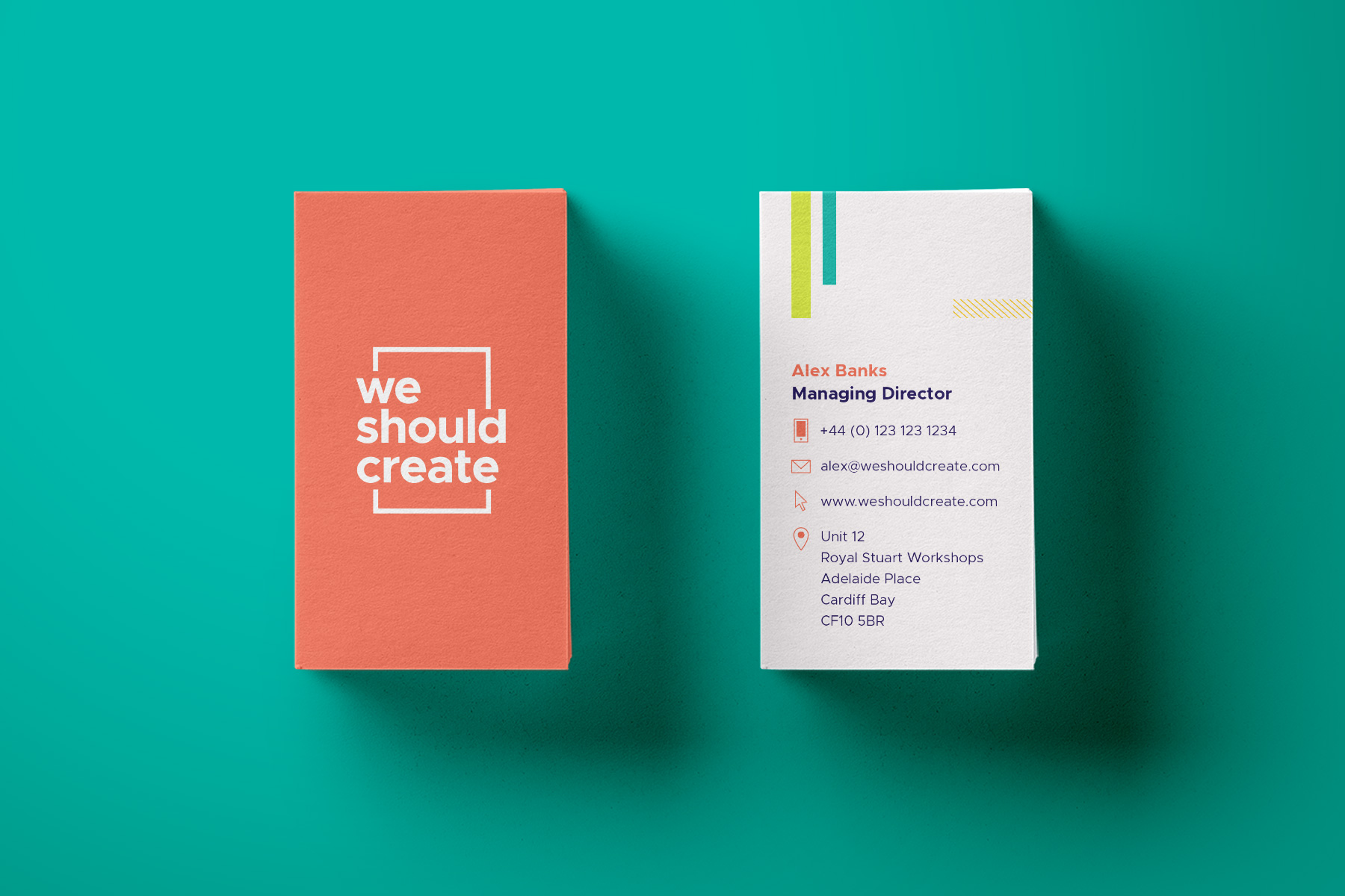
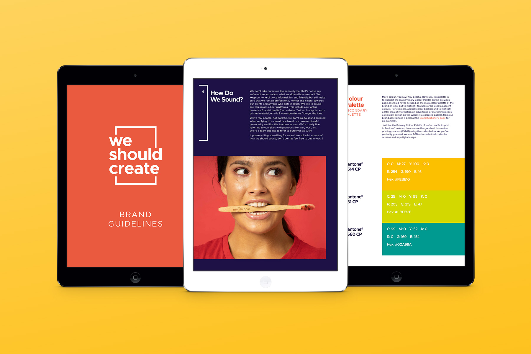
The team at We Should Create needed a brand refresh to match their new business strategy and their vivacious personality. The serif font in the old logo didn’t quite fit the bill, so a friendly geometric sans serif was used instead to complement their informal approach, surrounded by a simple frame to represent photography and videography. As ever in branding, the need for an adapting logo was vital, so master, landscape and icon versions were created to be used in any type of space on any platform. A further focus on digital platforms led the brand guides document to be created in a portrait format specifically to fit iPad screens. A vibrant and varied colour palette was created to reflect the focus on diversity and inclusivity within photoshoots, and further demonstrated the vitality of WSC.


